Reading what Journex shows you
Every screen here answers a different question, and a few of them use numbers that look alike but are measured on different bases. This walks through them one page at a time, so a figure never gets acted on for the wrong reason.
This guide starts after your trades arrive. Getting the EA onto MT5 and connected is covered separately, along with what to do when it will not connect. Setup and troubleshooting →
/dashboardDashboard — where the account stands
The opening screen answers one question: is this account working right now. Five figures across the top, the equity curve underneath, and a written summary of the session that just closed.
- Net Profit
- Closed trades only, after commission and swap. Floating positions are not in it.
- Win Rate
- Share of trades that closed positive. On its own it says very little — a 70% win rate loses money if the losses are large enough.
- Profit Factor
- Gross profit divided by gross loss. Above 1.0 the account makes money; the further above, the more room for a bad run.
- Max Drawdown
- The deepest peak-to-trough fall in the equity curve, across the full history. This is a performance figure — see the caveat below.
- Trading Cost
- Commission and swap totalled, so you can see what the account pays to exist before it pays you.
- Equity curve · monthly P&L
- Shape matters more than the endpoint. A curve that climbs in one straight jump is a different account from one that grinds upward.
- Hourly heatmap
- Which hours of the day you make and lose money, on your clock.
- Long vs short
- Whether one direction carries the account. A large gap usually means a market view, not an edge.
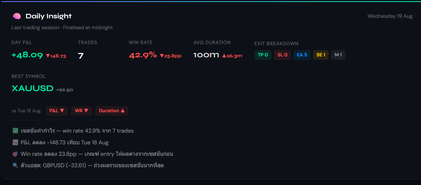
- Daily summary
- The last closed session written out in a sentence or two. It only covers sessions that have ended — today is still in progress and is left out on purpose.
 Sample data
 Sample data
!Max Drawdown here and the drawdown in the challenge tracker are not the same measurement. This one is peak-to-trough across everything you have traded, which is about performance. The challenge one is measured from your starting balance inside the challenge window and includes floating loss, because that is what the rule actually tests. Comparing the two numbers directly will mislead you.
/dashboardTrade log — one row per position
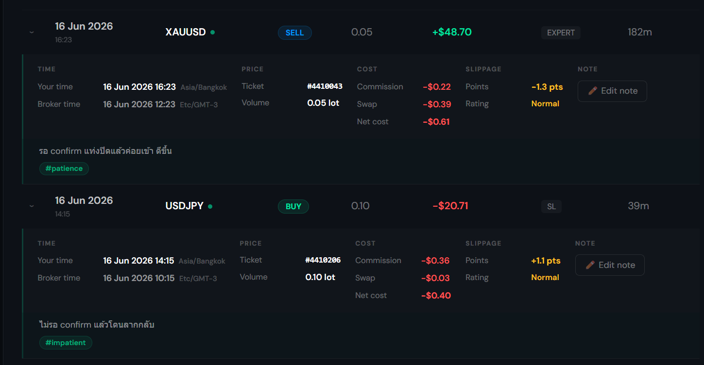
The same trades your terminal has, kept with the parts the terminal drops once the order closes. Click any row to open the detail underneath it.
- Date
- Your time is the main line. Broker time appears underneath only when the two fall on different days — when they agree, a second line is noise.
- Exit
- Take profit, stop loss, closed by hand, or closed by the EA. A stop-loss exit can still be profitable if you were trailing it.
- Duration
- How long the position was open. Zero means it opened and closed inside the same minute — a measured value, not a missing one.
- Commission · Swap · Net cost
- Broken out under the trade and totalled, rather than folded into the profit figure.
- Slippage
- The gap between the price you asked for and the price you got, in points. Blank means it could not be measured — never assume zero.
- Partial closes
- Scaling out of a position shows as one grouped row, not three unrelated trades.
- Note and tags
- Up to ten tags per trade. Written at the time, they are the only record of why you took it.
 Sample data
/mae-mfeMAE / MFE — what happened while you held
Two trades can close on the same profit and be nothing alike. This page measures how far price went each way before you closed, and turns that into a stop distance you can actually check against.
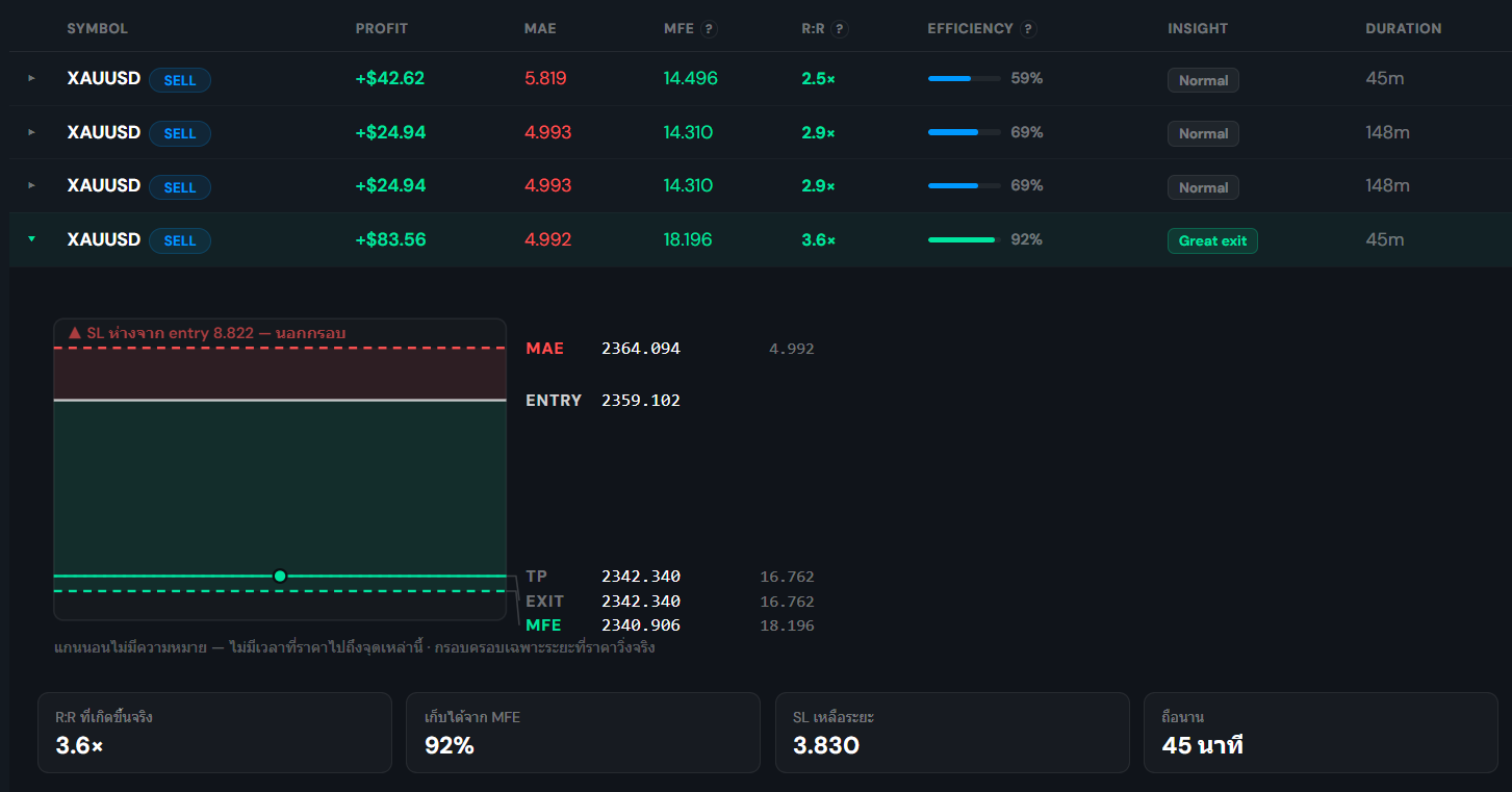
- MAE
- The furthest price moved against you before the trade closed. Your stop needs to sit outside where this usually lands, or you get taken out of trades that were going to work.
- MFE
- The furthest it moved in your favour. The gap between MFE and where you actually exited is the part you left behind.
- Efficiency
- On a winning trade, how much of the favourable move you kept. Low numbers across many trades point at exits, not entries.
- R:R
- MFE divided by MAE — the reward-to-risk that actually happened, which is usually not the one you planned when you set the stop and target.
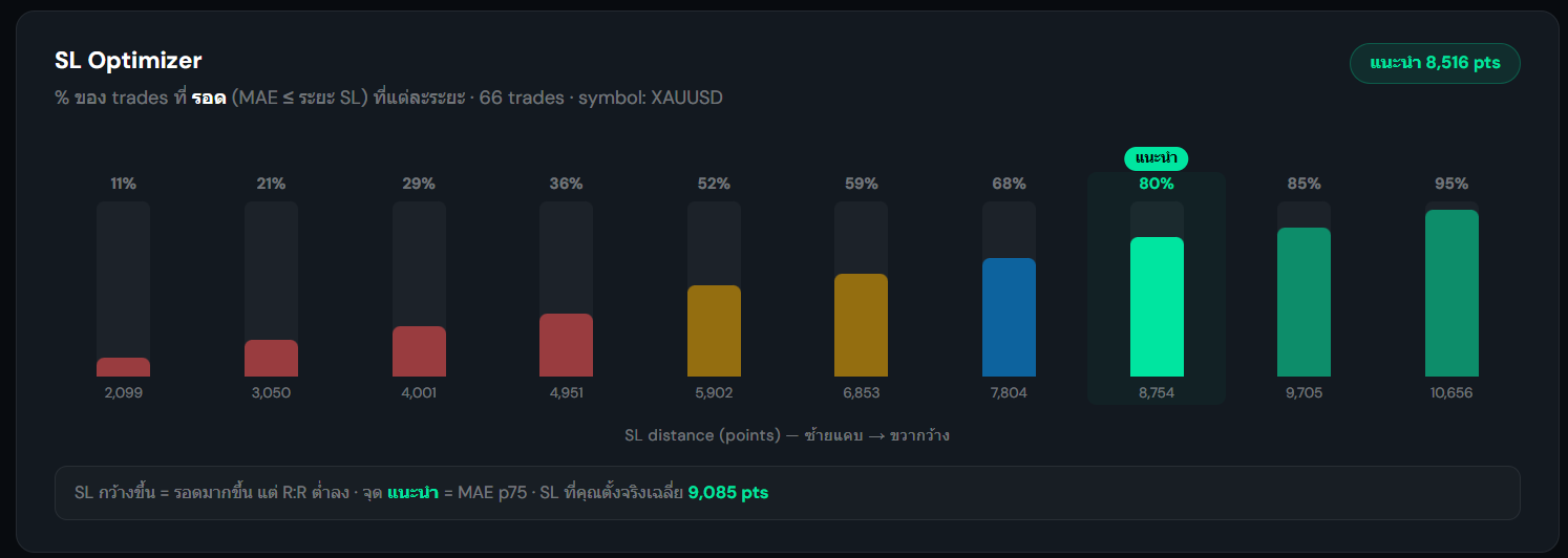
- SL Optimizer
- How many of your past trades would have survived at each stop distance. The curve flattens at the point where widening the stop stops buying you anything.
- Suggested SL / TP
- Three scenarios drawn from your own losses. Balanced sits at the 75th percentile of MAE — wide enough for three losses in four, without paying for the rare one.
- Per-trade diagram
- Click a row to see that one trade on a single price scale: entry, exit, both extremes, and where your stop and target sat relative to them.
 Sample data
 Sample data
!These figures need the high and low price reached while the position was open, which the EA started sending in May 2026. Trades recorded before that show a dash rather than a number — Journex will not fill the gap with the stop distance you happened to set, because that would quietly turn a suggestion about your stop into a function of that same stop.
/symbolsSymbols — which pair is doing the work
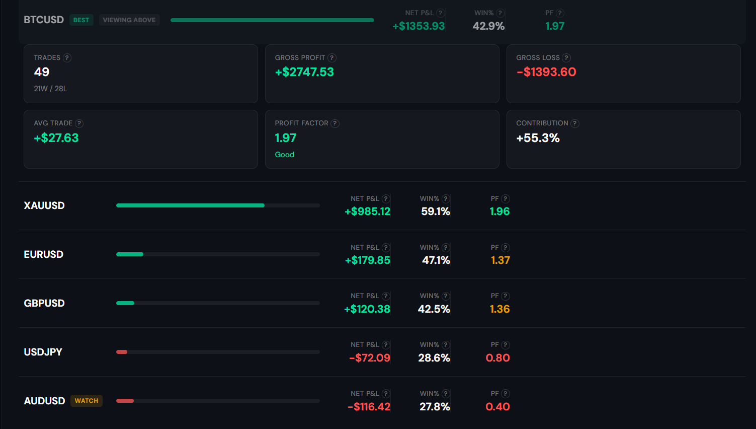
Account totals hide the fact that one instrument is usually carrying everything and another is quietly bleeding. This page splits the account apart.
- Contribution
- How much of the net result each symbol is responsible for. A single pair holding up the whole account is a concentration risk, not a strength.
- Per-symbol stats
- Win rate and profit factor per instrument. A strategy can be genuinely positive on one pair and negative on another.
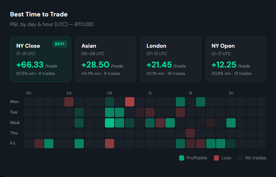
- Session heatmap
- Performance by market session, on broker time — because sessions are a property of the market, not of your day.
- Portfolio concentration
- Pairs you tend to hold at the same time, measured from the actual overlap in your trade times rather than a textbook correlation table. Two positions that always move together are one position at twice the size.
- Suggested Position Size
- The Kelly criterion run over your history on that symbol. See its own section below.
 Sample data
 Sample data
!Best Symbol picks the strongest of what you traded — it does not promise that symbol made money. On an account that lost across the board, the badge sits on the one that lost least.
/symbolsSuggested Position Size — a ceiling, not a target
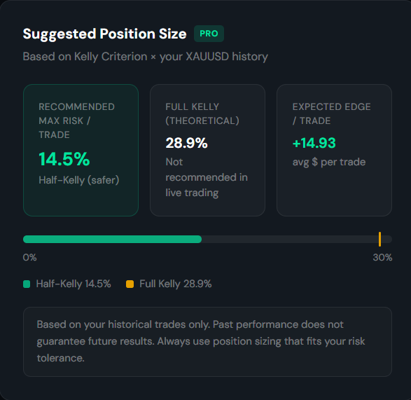
Most journals record the size you chose without an opinion on it. This one computes the ceiling the maths puts on risk per trade, from your own win rate and your own average win against your average loss.
- Recommended max risk
- Half-Kelly. This is the number to work from — and it is a ceiling, not something to aim at.
- Full Kelly
- Shown as a theoretical figure and labelled as something not to run live. It is the level where an ordinary run of losses becomes a drawdown most people cannot sit through.
- Expected edge
- Average dollars per trade on that symbol, from your history.
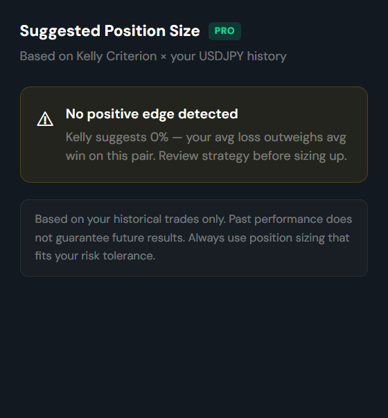
- When it appears
- Only once a symbol has twenty closed trades and a positive edge. If your average loss outweighs your average win it says so instead of printing a number.
 Sample data
 Sample data
!This describes what your history implies about sizing. It is not a prediction, and it is not advice to take any particular trade. Sizing above the ceiling can take down a strategy that genuinely has an edge, because the losing streaks arrive long before the maths has time to work.
/ea-tuningEA Tuning — settings against your own history
Your EA's inputs compared with what your closed trades actually did, explained in words instead of left as a table to decode.
- Magic number filter
- Run more than one EA and each has its own magic number. Filter to one before reading anything, or you are averaging two different strategies together.
- Suggestions
- Each one names the input it refers to and the figure from your history behind it, so you can check the reasoning rather than take it on trust.
- Exit reason split
- Trades the EA closed are separated from ones you closed by hand. They measure different things — an EA-managed exit says nothing about your discipline.
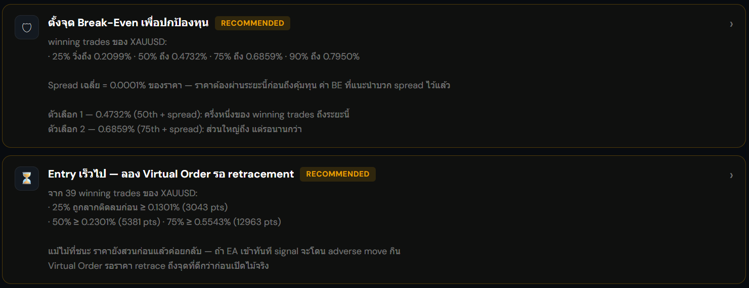 Sample data
/prop-trackerChallenge tracker — counting against the rules
Enter the limits you have to trade under and Journex counts them from your real trades, so the headroom left on each is a measured figure rather than something you keep in your head.
- Daily loss
- Measured from the day's opening equity down to the lowest point reached, including floating loss — which is what the rule tests, not the sum of your closed losers.
- Total loss
- Measured from the account size the challenge started at, per the provider's definition.
- Headroom
- What is left before each limit, in both dollars and percent, and the days that came closest to breaching one.
- Equity corridor
- Your equity drawn between the floor and the target, so a day near the edge is visible rather than something you work out.
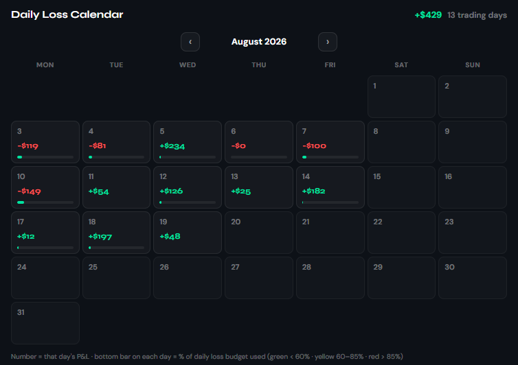
- Daily loss calendar
- Every trading day laid out on a calendar with that day's P&L and how much of the daily-loss allowance it used. A day with no trades is left blank, not zero.
- Objectives
- A pass, fail, or pending mark against each rule, drawn from the same violation record the tracker uses to flag a breach — not a separate judgment.
- Discipline Score
- How often a trading day came close to a limit, not how much you made. A profitable day that grazed the daily-loss floor still scores low here — it is a risk-proximity figure, not a performance one.
- Custom rules
- Enter the numbers yourself and you are not tied to a preset. Where the daily reset timezone is unknown, it stays blank rather than guessing.
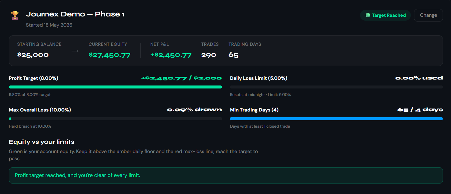 Sample data
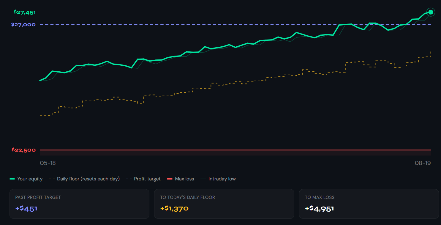 Sample data
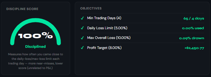 Sample data
 Sample data
!Counted from your history, not a forecast. Journex is not affiliated with, endorsed by, or sponsored by any challenge provider, and the figures here do not override what your provider's own dashboard says.
What the numbers do not say
A few habits that will keep you from acting on a figure for the wrong reason. These are the mistakes worth knowing about in advance.
- A dash is not a zero
- Where something could not be measured, Journex leaves it blank. It never fills the gap with a zero, because a zero you cannot trust is worse than an empty cell — you would act on it.
- Same name, different basis
- Drawdown on the dashboard and drawdown in the challenge tracker measure different things. So does the stop distance on the MAE/MFE page versus the one in EA tuning. Check what a figure is measured against before comparing it to another.
- Accounts sit side by side
- With more than one account, Journex compares them rather than adding them up. Summing a blown account into a live one, or two accounts in different currencies, produces a number that means nothing.
- Written summaries describe, they do not calculate
- The sentences on each page are produced by a language model that can only describe figures Journex has already computed. It cannot do arithmetic of its own, so a sentence can never introduce a number the page did not measure.
- Small samples say little
- Most pages hold a figure back until there are enough trades behind it. Where you see a note about sample size, it is load-bearing.
Three screens group trades by time and they deliberately do not agree, because they answer questions that live on different clocks. A time-of-day figure means nothing until you know which one it is on.
Still stuck on something?
If the EA is not connecting or the trades are not arriving, that is a different kind of problem and has its own page.